


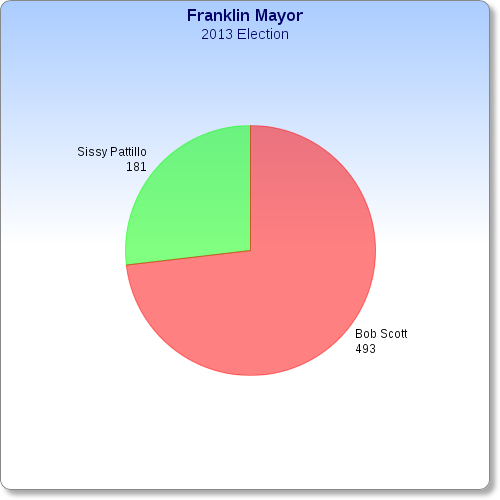
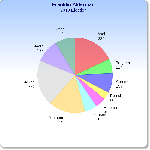
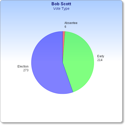
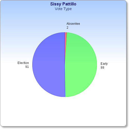
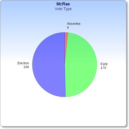
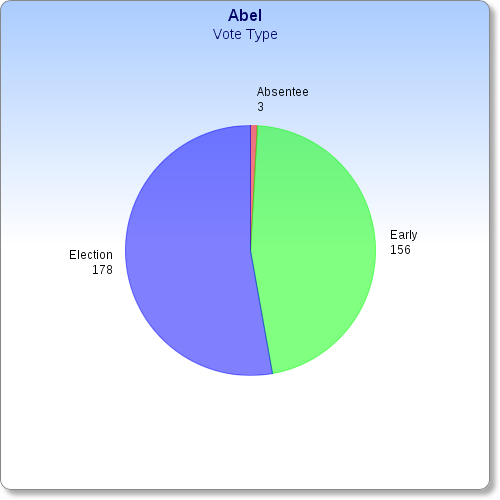
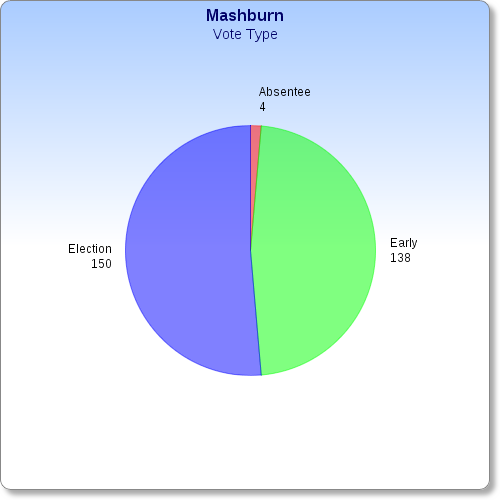
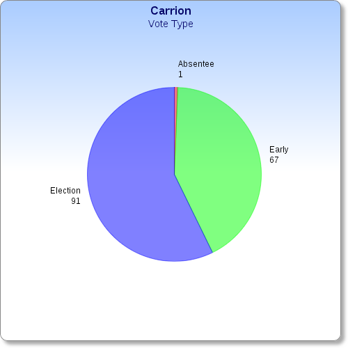
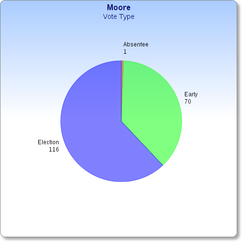
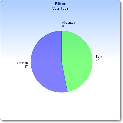
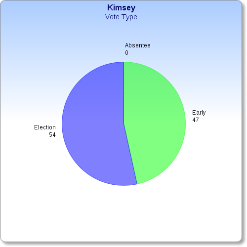
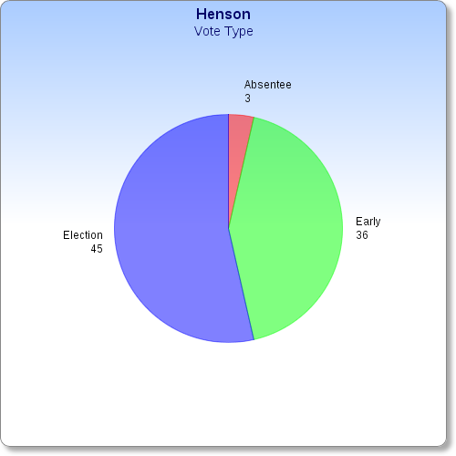
Those of you who know me know how much I love the opportunity to express data in visual formats, like charts and maps and so on. So, here are a series of graphs showing the results of Tuesday's election in visual terms.
Most of the pie charts should be self-explanatory, but I added a brief description below most of them anyway.

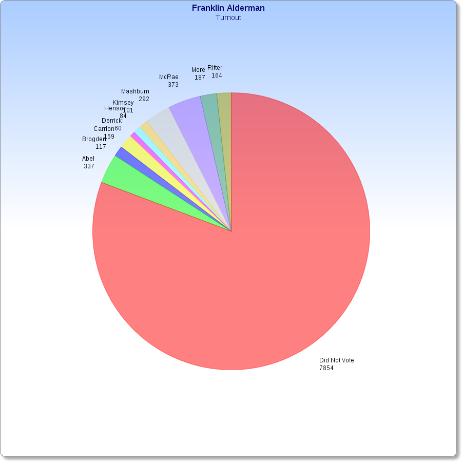

Voter participation in the Mayoral race. I counted the three write ins as not participating because the votes were not cast for a declared candidate.


0 comments :
Post a Comment